A customer journey map is one of the most widely created CX artifacts. It's also one of the most wasted. Teams run workshops, build detailed maps, present them to stakeholders, and then nothing happens. The map sits in a shared drive. Decisions keep getting made without it.
The problem isn't the practice. Customer journey mapping is the practice of visualizing how customers experience your organization across touchpoints and over time. Done well, it creates shared understanding, surfaces problems that no single team can see, and drives real improvement. Done poorly, it produces a pretty artifact that gathers dust.
This guide covers what a journey map is, what goes into one, how to build one that actually drives decisions, and the common mistakes that waste effort.
What is a customer journey map?
A customer journey map is a visualization of the end-to-end experience a customer has with your organization. It captures what customers do, what they think and feel, what they interact with, and where they struggle as they work toward a goal.
It's more than a diagram. A journey map makes the customer's reality visible to everyone in the organization. Product, marketing, operations, support. When these teams look at the same map, they stop arguing about whose perception of the customer is correct and start working from shared evidence.
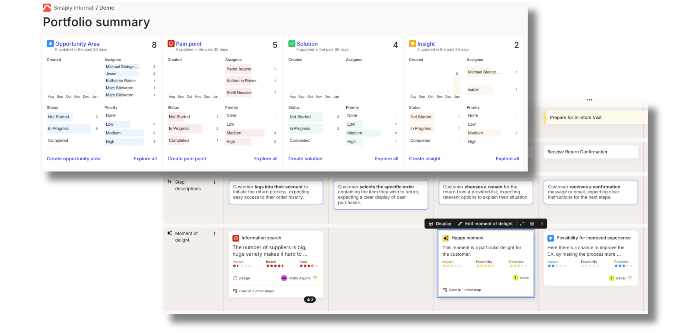
One distinction matters: customer journey mapping is the activity that produces the artifact. What you do with the map after it's built determines whether it creates value. A map that drives prioritization and improvement is a strategic tool. A map that sits in a folder is a waste of time. For a focused primer on what a customer journey map is and why it matters, see our explainer.
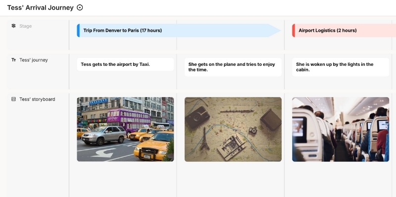
For a concrete example, explore an interactive customer journey map in Smaply, which shows how stages, touchpoints, and emotions come together on a single map.
Why customer journey maps matter
Cross-functional alignment. Customer experience doesn't live in one department. It spans product, marketing, operations, sales, and support. A journey map makes the full experience visible in one place, so teams can see how their work connects to what comes before and after. Disagreements about priorities surface early, when they're cheap to resolve.
Evidence over opinion. In organizations without journey maps, decisions about customer experience get made by whoever has the strongest opinion or the most political capital. A research-grounded journey map shifts the conversation to evidence. What are customers actually experiencing? Where are they actually struggling? These questions have answers, and the map makes those answers visible.
Systemic visibility. Individual touchpoints can perform well while the overall journey fails. A customer might rate a support call highly but still churn because the journey from purchase to onboarding was too painful. A journey map connects the dots between interactions and reveals the handoffs, gaps, and friction that no single team can see from their vantage point.
Connection to action. The best journey maps don't just describe the experience. They connect directly to improvement. Pain points link to initiatives. Opportunities link to roadmaps. When a map is structured for action, it becomes the starting point for decisions, not just a visualization.
A framework for journey mapping that drives action
Most mapping initiatives fail not because the map is wrong, but because the process around it is incomplete. Teams spend weeks building a detailed visualization and then wonder why nothing changes. The problem is usually a missing stage.
Journey mapping that drives improvement follows a four-stage cycle: Scope, Research, Map, Act.
Scope. Define one persona, one journey, one goal, and one purpose before anything else. "Map the customer journey" is not a scope. "Map how a mid-market prospect moves from evaluation to first value, to identify where we lose them" is. A clear scope prevents the most common failure mode: maps that are too broad to act on.
Research. Gather the evidence that will ground your map in reality. Customer interviews, support transcripts, analytics, survey data. The combination of qualitative and quantitative sources matters. Qualitative tells you why customers struggle. Quantitative tells you how many are affected. Maps built only on internal assumptions create shared fiction, not shared understanding.
Map. Build the visualization collaboratively. Lay out stages, populate touchpoints, layer in emotions and pain points. Cross-functional input is essential here. Support knows things product doesn't. Sales sees things marketing can't. A map built by one team always has blind spots.
Act. Connect pain points to initiatives. Assign ownership. Link opportunities to roadmaps. This stage is where most teams stop short, and it's where all the value lives. A map without an action plan is a poster.
The cycle repeats. Customer experiences change as you ship new features, adjust processes, or enter new markets. A map that isn't revisited becomes a historical artifact within months. Each pass through the cycle sharpens the map and closes the gap between what customers experience and what you intend.
This isn't a one-time project. It's a practice. The teams that get lasting value from journey mapping are the ones that build this cycle into how they work, not the ones that produce the prettiest map.
One shift is worth noting. A journey map used to be a workshop artifact: accurate the day it was made, then slowly drifting out of date. Increasingly, teams feed live behavioral and analytics data into the map so it stays current between formal cycles, instead of waiting for the next workshop to surface what changed. That continuous, data-fed version of the practice is what turns one-off mapping into ongoing journey management.
Types of customer journey maps
Not all journey maps serve the same purpose. Picking the right type matters more than perfecting the format.
| If you need... | Use... |
|---|---|
| Diagnosis of current experience | Current state map |
| Vision for a redesigned experience | Future state map |
| Broader context beyond your brand | Day-in-the-life map |
| Operational clarity on internal processes | Service blueprint |
Current state maps
A current state map captures how customers experience your organization today. It's grounded in research and data, not aspirations. This is the most common type and the best starting point for organizations new to mapping.
Use current state maps to diagnose friction, identify drop-offs, and align teams on reality. They're particularly valuable when teams disagree about what the customer experience actually looks like, because the map settles that disagreement with evidence.
Future state maps
A future state map visualizes the experience you want to create. Instead of documenting what is, it defines what should be. These maps are useful for product planning, service redesign, and strategic alignment.
Future state maps work best after you've mapped the current state. Without understanding where things break today, it's difficult to design something meaningfully better. They're a planning tool, not a starting point.
Day-in-the-life maps
A day-in-the-life map widens the lens beyond your organization. It captures a customer's full day, including activities and interactions that have nothing to do with your product or service. The goal is context.
These maps reveal unmet needs that traditional touchpoint-focused maps miss. When you understand what your customer is dealing with before and after they interact with you, you find opportunities that competitors focused only on their own touchpoints will never see.
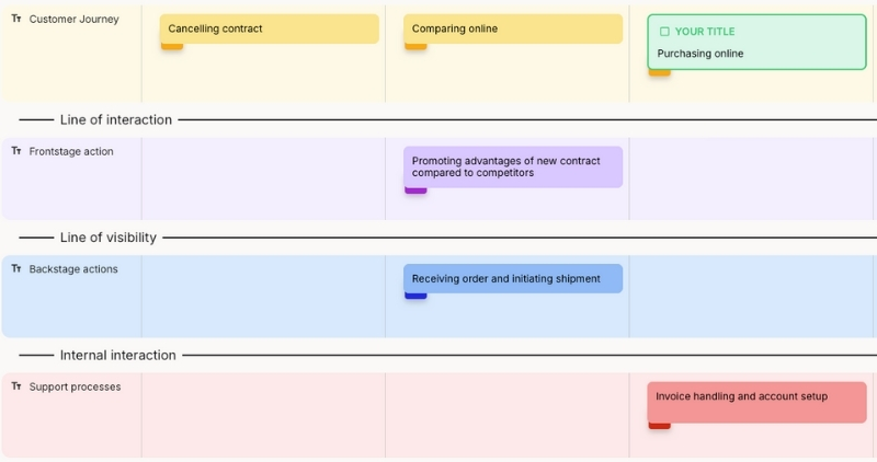
Service blueprints
A service blueprint extends a journey map by layering in the internal processes, systems, and teams behind each customer interaction. Where a journey map shows what the customer sees, a blueprint shows what happens backstage to make it possible.
Service blueprints are powerful for operational improvement. They expose internal bottlenecks, disconnected systems, and handoff failures that create customer-facing problems. If your issues are rooted in how work gets done internally, a blueprint is the right format.
Key elements of a customer journey map
Every journey map needs a core set of elements to be useful. Skip any of these and the map loses either clarity or strategic value.
Personas. Each map should represent one persona's experience. Different customer segments experience the same journey differently, with different expectations, different pain points, and different emotional responses. Mapping for "all customers" produces something too generic to act on.

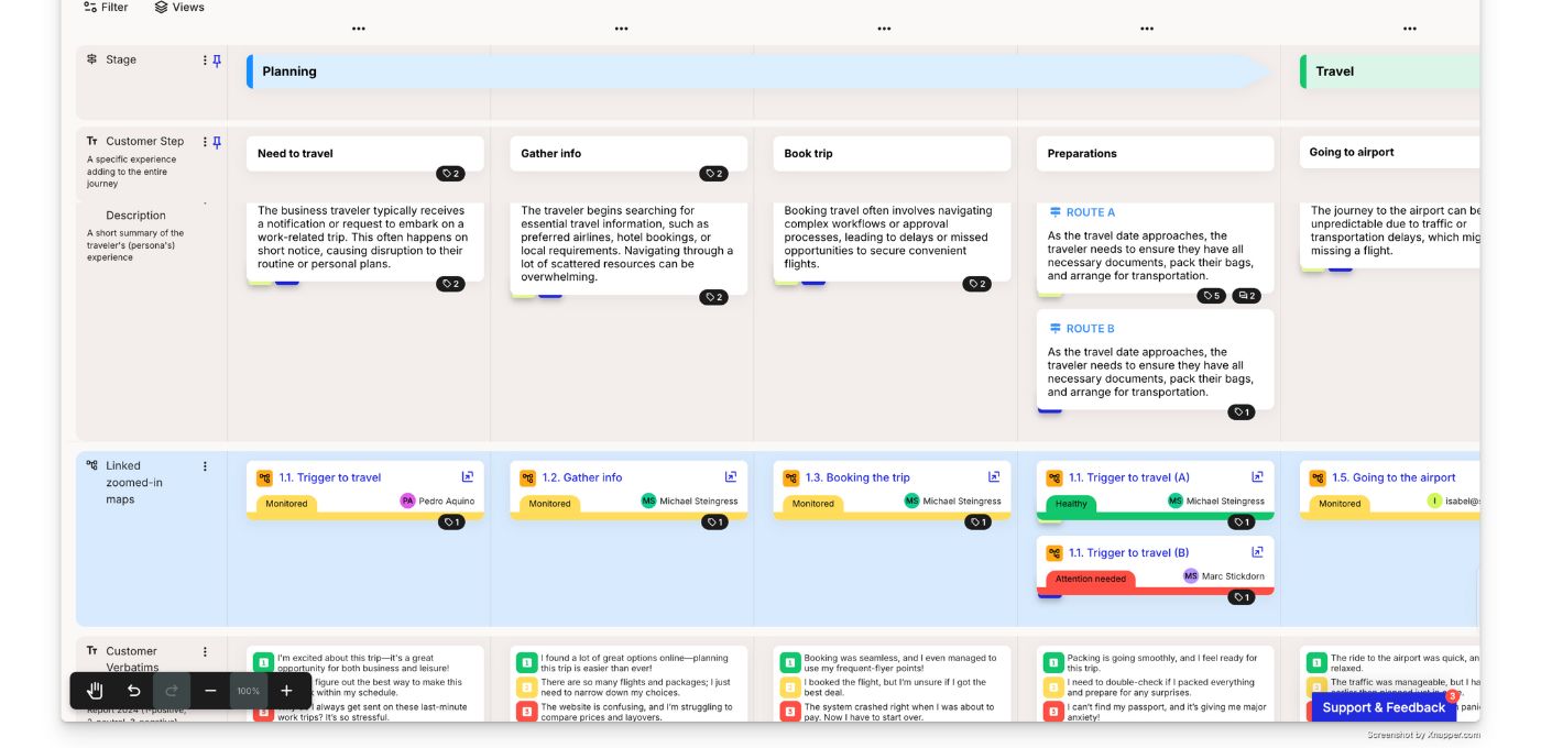
Stages. The high-level phases of the journey: awareness, consideration, purchase, onboarding, retention, or whatever stages match your customers' reality. Stages create structure for analysis and comparison. They should reflect how customers move through the experience, not how your internal process is organized.
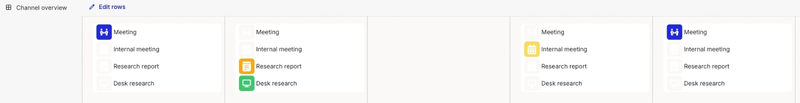
Touchpoints. The specific interactions between customers and your organization. Websites, emails, calls, stores, apps, chatbots. Mapping touchpoints reveals where the experience actually happens and where gaps or redundancies exist. It often helps to group touchpoints into pre-purchase, purchase, and post-purchase phases, so you can see whether friction clusters before, during, or after the moment of conversion.
Actions. What customers do at each stage. The behaviors, steps, and decisions they take as they try to accomplish their goal. Actions ground the map in observable reality rather than internal assumptions.
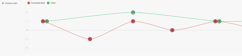
Emotions. How customers feel at each point in the journey. Emotional mapping reveals where the experience delights and where it frustrates. Often visualized as a curve or rating scale, emotions are what turn a process diagram into a story that stakeholders care about.
Pain points and opportunities. Where the experience breaks down and where it can be improved. These are the strategic core of the map. Everything else is context. Pain points and opportunities are where decisions get made.
Channels. The mediums through which interactions happen: web, mobile, phone, in-person, email. Mapping channels alongside touchpoints reveals omnichannel gaps, moments where customers switch channels and the experience breaks.
How to create a customer journey map
The full process breaks into five steps, each building on the one before.
Define your scope
Start by narrowing. Choose one persona, one journey, one goal. Trying to map everything at once produces maps too complex to use and too broad to drive specific action. Pick the journey that matters most to your organization right now, whether that's onboarding, purchase, support, or renewal.
Define what "done" looks like before you start. Are you mapping to diagnose a known problem? To align teams? To redesign a service? The purpose shapes the depth, detail, and format you need.
Gather evidence
The strongest journey maps are grounded in customer evidence, not internal assumptions. Combine qualitative research (customer interviews, diary studies, support transcripts) with quantitative data (analytics, conversion funnels, survey results). Qualitative tells you why. Quantitative tells you how much.
Assumption-based maps have a place. If you're early in discovery and need to align stakeholders on a shared starting point, a map built on internal knowledge is faster than waiting for research. Just don't mistake it for validated truth. Revisit it once you have real customer data, or it becomes a liability.
Map the journey
Lay out stages first to establish the overall structure. Then populate each stage with touchpoints, actions, emotions, and pain points. Plot the emotional curve deliberately rather than treating it as a byproduct: charting how the customer feels at each step is what surfaces the highs to protect and the lows to fix. Work collaboratively whenever possible. Journey mapping workshops that include perspectives from product, support, sales, and operations produce maps that are more complete and more likely to be used.
Don't aim for perfection on the first pass. Start with what you know and refine as you learn more. A rough map that captures the critical moments is more useful than a polished map that took months to produce.
Identify pain points and opportunities
This is where the map becomes strategic. Analyze the completed map for friction, drop-offs, emotional lows, and handoff failures. Look for patterns: are problems concentrated in one stage? Do they cluster around channel transitions? Are they caused by internal process gaps?
Prioritize based on impact and feasibility. Not every pain point is worth fixing. Focus on the moments that matter most to customers and to the business. A prioritized list of improvements grounded in customer evidence is worth more than a perfect map.
Act on the findings
The map is the beginning, not the end. Without a plan for what happens next, the mapping exercise produces awareness but not change.
Connect pain points to improvement initiatives. Link opportunities to product roadmaps or service redesign projects. Define ownership: someone needs to be responsible for driving action from the map's insights, not just maintaining the document.
Set a review cadence. Customer experiences change as your organization ships new features, adjusts processes, or enters new markets. A map that isn't maintained becomes a historical artifact within months. Quarterly reviews are a reasonable starting point for active journeys.
The transition from mapping to ongoing management is where the real value appears. Customer journey management is the practice that turns a one-time mapping exercise into a continuous system for improvement. For a detailed step-by-step process, see our guide on how to create a customer journey map.
Common customer journey mapping mistakes
The same six mistakes show up again and again.
- Mapping your internal process instead of the customer's experience
- Building on assumptions without real customer research
- Cramming in so much detail the map becomes unusable
- No plan for what happens after the map is presented
- Treating the map as one-and-done instead of maintaining it
- Mapping in isolation, without cross-functional input
Mapping your process, not the customer's experience. The most common mistake. Internal process maps dressed up as journey maps miss the point. The map should reflect what the customer does, thinks, and feels, not how your organization is structured behind the scenes.
Building on assumptions alone. Maps built entirely on what internal teams believe, without customer research, create shared fiction rather than shared understanding. They feel productive but lead to solutions for problems customers may not actually have.
Too much detail. Maps crammed with every possible touchpoint, subprocess, and data point become unreadable and unusable. Match the level of detail to the decision you're trying to make. A map for executive alignment needs different depth than a map for service redesign.
No plan for what happens next. The map is created, presented once, and forgotten. Without governance, ownership, and a connection to prioritization, the effort doesn't translate to improvement. Build the "after the map" plan before the workshop, not after.
One and done. Customer experiences change. Competitors evolve. Your organization ships new products. Maps need maintenance. A journey map that reflects last year's experience is worse than no map at all, because it creates false confidence.
Mapping in isolation. Journey maps built by one team without cross-functional input miss critical handoffs and backstage dependencies. Support knows things that product doesn't. Sales sees things that marketing can't. The best maps are built collaboratively.
For a deeper dive, see our breakdown of common journey mapping pitfalls and how to avoid them.
Frequently asked questions
What are the 5 stages of a customer journey map?
The most common stages are awareness, consideration, purchase, retention, and advocacy. But these aren't universal. Your stages should reflect how your customers actually move through their experience with your organization. A B2B company with a six-month sales cycle will have different stages than an e-commerce retailer.
What's the difference between a customer journey map and a service blueprint?
A journey map captures the customer's experience: what they do, think, and feel across touchpoints. A service blueprint adds a layer underneath showing the internal processes, systems, and people that support each interaction. Think of a blueprint as a journey map plus the backstage operations that make it happen.
What's the difference between a customer journey map and an experience map?
An experience map is more general. It visualizes a broad human experience around a goal or activity, without being tied to one company or one persona. A customer journey map is narrower and persona-specific, tracing how a defined customer moves through their relationship with your organization. If the work is not yet anchored to a specific persona and a specific relationship, what you are building is closer to an experience map.
How long does it take to create a customer journey map?
A basic assumption-based map can be drafted in a single workshop (2-4 hours). A research-grounded map typically takes 2-6 weeks, including customer interviews, data analysis, and collaborative mapping sessions. The timeline depends on scope, available research, and organizational complexity.
Should you use a template or build a customer journey map from scratch?
Templates are useful as starting structures, especially if you're new to mapping. They provide consistent frameworks and save time on layout. But don't let a template dictate your content. Adjust stages, elements, and detail levels to match your specific journey and goals.
How do you keep a customer journey map up to date?
Assign an owner. Set a review cadence, quarterly at minimum for active journeys. Update the map when significant changes happen: new touchpoints, process changes, research findings, or metric shifts. The goal is a map that reflects current reality, not one that's permanently polished.
Customer journey mapping creates value when it drives decisions, not when it produces a deliverable. The map is the starting point. What matters is what comes after: who owns it, how it's maintained, and whether it connects to the work that actually improves the experience.
Start with one persona and one journey. Ground it in the best evidence you have. Get cross-functional input. Identify the pain points that matter most. And build the system that keeps the map alive and connected to action.
The difference between organizations that map journeys and organizations that improve them is not the quality of the map. It's the practice they build around it.