
The tool you choose shapes whether journey mapping becomes a habit or a one-off. This guide covers the leading options — what each one is genuinely good at, where each falls short, and what to consider before committing.
What to look for before choosing
Mapping vs. management
Some tools are built to help you produce a good-looking journey map. Others are built to help you use it — to make decisions, track improvements, and connect customer insight to delivery. Before evaluating features, know which problem you're actually trying to solve.
If your journey maps tend to gather dust after the workshop, a more structured tool with portfolio management and research connectivity will serve you better than a more polished visual output.
Structure vs. flexibility
Whiteboarding tools give you a blank canvas. Dedicated journey mapping tools give you a framework — stages, steps, lanes, cards. Structure slows you down at the start and speeds you up at scale. Flexibility feels faster at first, and becomes harder to maintain as journeys multiply and teams grow.
Single use vs. system
Can the tool manage more than one journey? Can portfolio items — pain points, opportunities, solutions — be reused across journeys so you're not duplicating work? Can you track what changed, why, and what got done? At a certain scale, the tool you use for mapping needs to become the tool you use for prioritization and follow-through.
Integration needs
Integrations matter, but only the ones you'll actually use. A deep two-way sync with Jira is valuable if engineers live there. Google Analytics in your journey view is useful if you want to ground decisions in data. An integration library of 250+ tools is less useful if it adds complexity without adding clarity.
1. Smaply

Best for: CX teams, service designers, and organizations that need journey mapping to drive decisions over time — not just workshops.
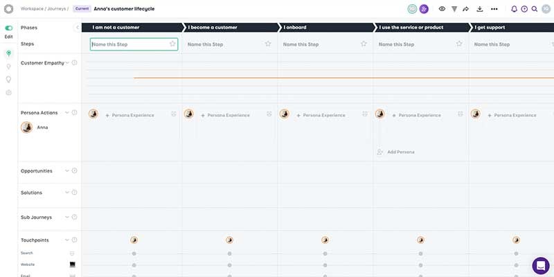
Smaply was built by service design practitioners, co-founded by Marc Stickdorn, author of This is Service Design Thinking and This is Service Design Doing. That background shows in how the platform is structured: journeys aren't decorative artifacts here — they're decision tools.
The core of Smaply is a structured journey map editor with stages, steps, lanes, and cards. Lane types cover the full range of service design needs: text, emotion charts, pain points, opportunities, solutions, metrics, planning, and linked journey maps. What makes this meaningful is that the content in those lanes isn't isolated to one map.
Portfolio items (pain points, opportunities, solutions) live at workspace level and can appear across multiple journeys. Edit a portfolio item once and it updates everywhere it appears. That's the difference between managing a library of insights and endlessly copying and pasting between documents.

Research Hub connects qualitative research to those insights. You upload customer feedback, transcripts, or interview notes; AI-assisted synthesis helps identify themes and extract evidence. Insights link directly to portfolio items and journey maps, so when a stakeholder asks "where did this pain point come from?" — you can show them.
Linked Journey Maps let you build navigable hierarchies of journeys — from high-level lifecycle maps down to detailed process flows — so teams can move between strategic and operational views without losing context.
Metrics integrations with Google Analytics, Power BI, and Excel 365 bring live data into the journey context. Quantitative signals sit alongside qualitative evidence in the same view, grounding prioritization in both.
Planning integrations (Jira, Asana, Trello, Azure DevOps, Linear, Monday.com) connect opportunities and solutions to the delivery teams responsible for them. When an insight becomes a Jira ticket, that connection stays visible in the journey.
Personas are reusable across journey content. You can assign personas to individual cards, filter journey views by persona, and see at a glance which journeys each persona appears in.
Collaboration works at multiple levels: real-time editing, commenting for viewers, saved views that tailor what different stakeholders see, and HTML sharing for read-only access without requiring an account.
Governance features include role-based permissions (Admin, Editor, Viewer) scoped at account, workspace, or individual journey level — practical for teams that need to share maps with executives or external partners without opening up the whole workspace.
What it's not: Smaply is not a freeform whiteboard. If you need open-ended brainstorming on an infinite canvas, Miro or Lucidspark will serve you better. Smaply's structure is a deliberate trade-off — it makes journeys maintainable, not just expressive.
Pricing:
- Forever free plan
- Repository: €390 per user/year
- Framework: €690 per user/year
- Governance: €990 per user/year

2. TheyDo
Best for: Large enterprises that need journey management at scale, with deep integration between journey insight and delivery roadmaps.
TheyDo has positioned itself clearly in the enterprise segment. In late 2025, Forrester launched the first-ever Customer Journey Management Platforms Wave, and TheyDo was named a Leader. The category validation reflects how seriously large organizations are now treating the discipline.
The platform organizes journeys in a hierarchical framework (L0, L1, L2 levels), which supports both lifecycle-level thinking and step-level operational detail. Insights, opportunities, and solutions are connected across that hierarchy, and a scoring system helps surface priorities based on impact.
AI features include journey mining from unstructured qualitative data — transcripts, feedback, support logs — to surface themes and map them to journey touchpoints automatically.
The Jira integration is two-way and syncs solutions directly to Jira projects, keeping product and engineering teams aligned with the journey layer rather than working in parallel.
What it is not: TheyDo's learning curve is real. The conceptual framework (the difference between opportunities and solutions, between sub-journeys and connected journeys) takes time to internalize. Teams that want to map quickly and iterate may find the overhead frustrating early on.
Pricing:
- Free plan available
- Management: from €39,000 per year (unlimited users)
- Strategic: from €48,000 per year (unlimited users)
The unlimited-user model changes the economics for large enterprises, but puts it well out of reach for smaller teams.
3. Miro
Best for: Collaborative workshops, cross-functional sessions, and teams that prioritize real-time ideation over structured journey management.
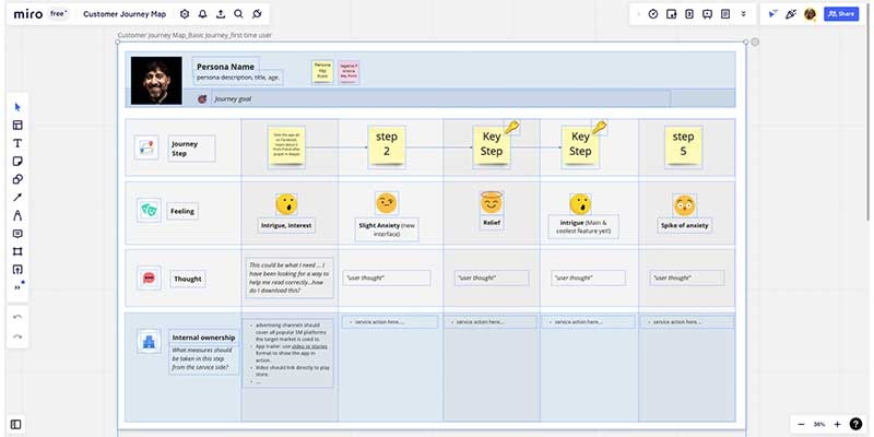
Miro is the whiteboarding tool most people already know. Its infinite canvas, 3,000+ templates, and real-time collaboration features make it excellent for workshop facilitation — the kind of session where you want to move fast, think visually, and capture whatever comes up.
Recent additions include Miro AI, which supports sticky note clustering, content generation, and diagram creation. The integration ecosystem connects to over 250 tools, including Jira, Confluence, Slack, and Figma. You can link journey maps to Jira tickets, sync updates to Confluence, and share findings in Slack.
The trade-off is in maintainability. A Miro journey map is as structured as the person who made it decided to make it — which means that across teams and time, consistency is hard to enforce. Journey maps in Miro tend to be great workshop outputs and poor long-term decision tools.
What it is not: Miro does not manage a portfolio of insights across journeys. It doesn't track which pain points have been addressed, or surface priorities across a system of maps. For teams who have moved beyond single-project mapping, those gaps matter.
Pricing:
- Free plan (3 editable boards)
- Starter: $8/user/month (billed annually)
- Business: $16/user/month (billed annually)
- Enterprise: custom pricing
4. UXPressia
Best for: Practitioners who want a dedicated journey mapping tool with a gentler learning curve — and teams where visual quality of deliverables matters.
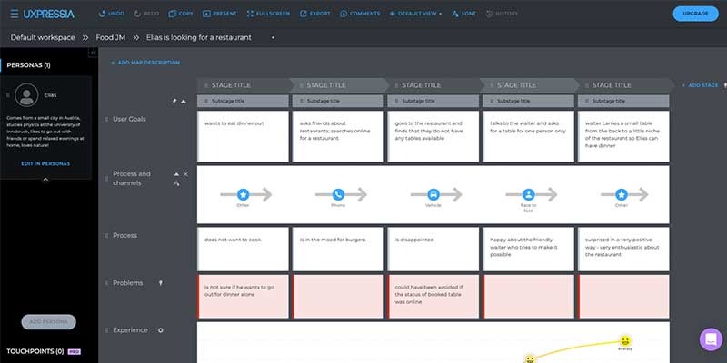
UXPressia is purpose-built for journey mapping, personas, and impact maps. The interface is accessible and polished, which makes it a good entry point for teams new to structured CJM without a large learning investment.
The platform has added AI capabilities that generate journey maps from prompts, support persona conversations (you can have a dialogue with a persona to explore insights), and translate maps into 50+ languages — useful for global teams. Design View provides a hierarchy layer for organizing initiatives and journeys.
Export quality is a strength: high-resolution PNG, PDF, PPTX, and CSV outputs make UXPressia deliverables easy to share with stakeholders who aren't in the tool.
Integrations include Google Analytics, Google Sheets, Mixpanel, Slack, Jira, and Azure DevOps.
What it is not: Journey management depth is more limited here than in Smaply or TheyDo. Portfolio-level prioritization, cross-journey reuse of insights, and research synthesis workflows aren't strengths. Teams that need journey mapping to feed directly into delivery prioritization may outgrow UXPressia over time.
Pricing:
- Free plan (3 maps, personas, impact maps)
- Pro: $36/user/month
- Business: $95/user/month
- Enterprise: on request
5. Lucidspark and Lucidchart
Best for: Workshop facilitation and backstage process visualization, especially for teams already in the Lucid ecosystem.
Lucid offers two distinct tools. Lucidspark is a whiteboard for collaborative sessions — good for workshops, ideation, and early-stage journey drafting. Lucidchart handles structured diagramming, which makes it useful for service blueprints, system maps, and process flows that sit behind the customer-facing journey.
Both share a dashboard, which means a team can move between the customer journey workshop (Lucidspark) and the backstage process map (Lucidchart) without losing project context. Integrations with Slack, Jira, and Google Drive are solid.
What it is not: Neither tool is optimized for ongoing journey management. There's no portfolio layer, no research synthesis, and no mechanism for tracking what's been prioritized or acted on across a body of journeys.
Pricing:
- Individual: €9/month
- Team: €30/user/month
- Enterprise: €35/user/month
6. Custellence
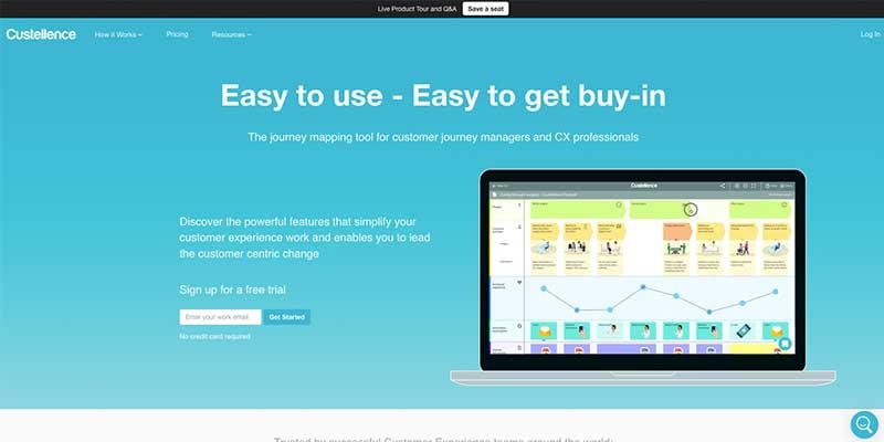
Best for: Experienced practitioners who want to move fast and value simplicity over breadth.
Custellence has been in the market longer than most tools on this list, and it shows in the focus on getting a clean, structured journey map created quickly. The UI is direct. Card deep links let you share a specific touchpoint with a collaborator without sending them on a navigation hunt. Journey hierarchies let you organize maps at different levels of granularity.
What it is not: Onboarding resources are limited, which can make the initial learning curve steeper than it needs to be for teams new to the platform.
Pricing:
- Free plan
- Team: $199/month (unlimited users)
- Enterprise: on request
7. Milkymap
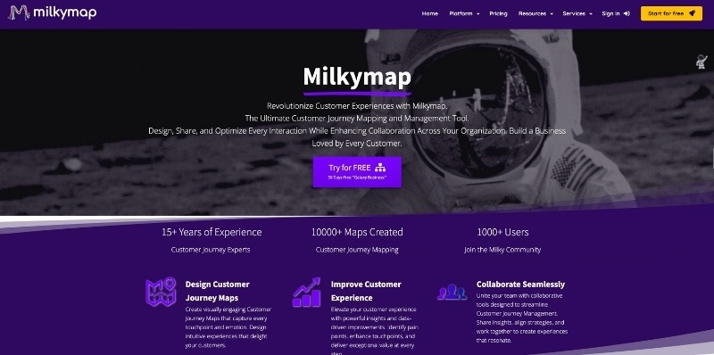
Best for: Teams that want lifecycle and management views alongside standard journey mapping, and who value an option to build custom templates.
Milkymap has grown since its 2019 launch, acquiring a consultancy and building academic partnerships. The lifecycle and management view layers give a different perspective on journeys over time, and the ability to create your own templates supports consistency across a team.
What it is not: The UI has aged, and usability suffers for it. The helpdesk is harder to navigate than it should be.
Pricing:
- Free plan
- Pro: €9/month (single user)
- Galaxy Business: €39/user/month
- Galaxy Enterprise: on request
8. Quadient Inspire Journey
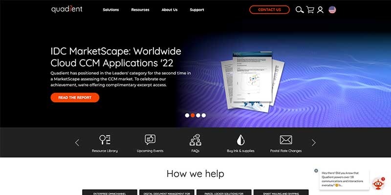
Best for: Enterprise teams with customer communications management (CCM) needs and an existing Quadient stack.
Quadient Inspire Journey is built around omnichannel experience orchestration — mapping and managing journeys across communications channels. The actionable dashboards and drag-and-drop builder are designed for CX teams that need to coordinate outbound communications as part of their experience work.
What it is not: This is specialized enterprise software. It's complex to configure and priced accordingly. It's not a good fit for standalone CX practitioners or teams without existing CCM infrastructure.
Pricing: On request.
9. Cxomni
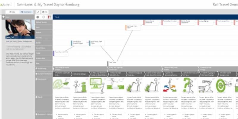
Best for: Organizations that need data-heavy dashboards alongside journey maps, with connections to a large number of analytics data sources.
cxomni combines structured journey maps with sophisticated analytics — charts, diagrams, and KPIs displayed in the context of the journey. Integration with around 50 data sources makes it a reasonable option for teams where quantitative signals drive prioritization.
What it is not: High pricing (user reviews consistently flag this) puts it in the enterprise-only bracket. Teams without dedicated data infrastructure may find the setup overhead outweighs the benefit.
Pricing: From $990/month; Enterprise on request.
10. Flowmapp
Best for: UX and product teams working on website and app experience, where sitemaps and user flows sit alongside journey maps.
Flowmapp brings together journey maps, sitemaps, and flowcharts in one workspace — a useful combination for teams whose customer experience work is primarily digital. The demo project, accessible without signing up, lowers the barrier to evaluation.
What it is not: File-sharing functionality is limited, and creating an offline journey is more difficult than it should be. Journey management depth is not a focus.
Pricing:
- Free plan
- Pro: $15/month (unlimited editors)
- Team: $35/month (unlimited editors)
- Agency: $99/month (unlimited editors)
11. SuiteCX
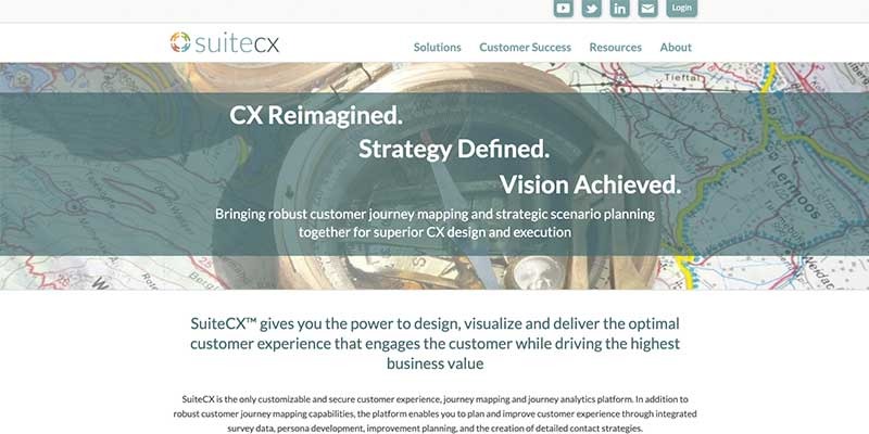
Best for: Organizations that want CX consulting and training bundled with their software, particularly those earlier in their CX maturity.
SuiteCX's primary differentiation is services — training, coaching, and consulting are built into the offering. The software itself is capable, and the support model means you're not figuring out methodology on your own.
What it is not: One of the most expensive options on this list. SMBs and most mid-market teams won't get a return on the premium pricing.
Pricing:
- Small Business: $5,000 per project (1–2 users)
- Enterprise: from $2,500/month
12. PowerPoint and Excel (plus Google equivalents)
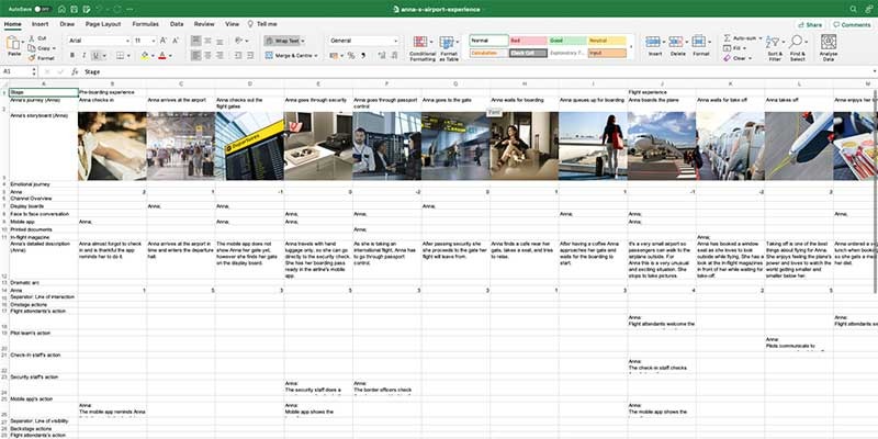
Best for: Creating one-off deliverables, presenting journey maps to stakeholders, or getting buy-in in environments where everything runs on Office.
Familiar, accessible, and free within most organizations. For agencies creating bespoke journey maps as client deliverables, these tools remain practical. For internal CX teams that need to maintain and evolve journeys over time, the limitations are significant: no traceability, no shared portfolio, no connection to research or delivery tools, and no way to update a map in one place and see those changes reflected elsewhere.
PowerPoint and Excel are presentation layers, not experience management systems. They're a starting point and a communication channel — not a substitute for a purpose-built tool if journey mapping is core to how your organization works.
Pricing: Included in Microsoft 365; Google Slides and Sheets are free.
How to choose
Start with the right question. Not "which tool has the best journey map editor?" but "what do we need this tool to enable?" If the answer is "better workshops," the flexibility of Miro or Lucidspark may be enough. If the answer is "decisions that stay connected to customer evidence over time," you need structured management capabilities.
Match the tool to your team's maturity. A CX team that is just starting out benefits from accessible tools with good templates and low friction — UXPressia or Miro are reasonable entry points. A team managing a portfolio of journeys across multiple product lines and cross-functional stakeholders needs the traceability and governance that Smaply or TheyDo provides.
Think about adoption, not just features. The best journey mapping tool is the one your team actually uses. A tool with 50 integrations and a steep learning curve may sit unused. A tool that gets picked up easily and builds consistent habits creates compounding value.
Check what happens after the workshop. Ask the vendor: how do teams track which pain points have been prioritized? How do they connect research to journeys? How do they show leadership which improvements have been made? If the answers are vague, the tool is probably better at producing maps than using them.
Pricing and features change. For the most current information, check each provider's website directly. This article was last updated in March, 2026.
DO YOU FIND THIS OVERVIEW USEFUL?
SHARE IT WITH YOUR NETWORK!


