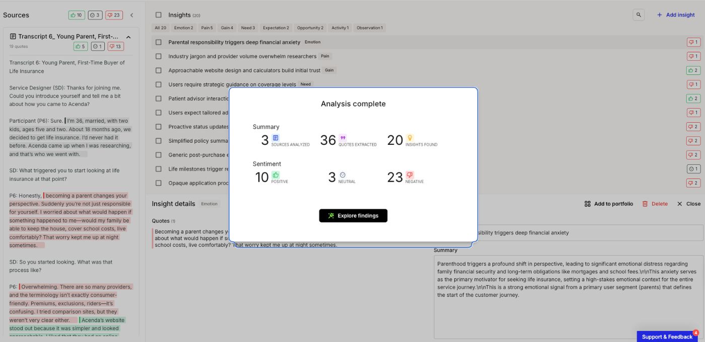
A mapping workshop ends with nineteen pain points on the board. Everyone agrees they're real. Two weeks later the list sits in a shared doc, three items have been marked high priority by three different people, and nothing has shipped.
That is where customer journey improvement usually stalls. The evidence is there. What's missing is an agreed way to choose between the things the evidence surfaced, and an agreed way to tell afterwards whether the choice was any good. Both are solvable, and neither needs a bigger research budget. What they need is treating one change at a time as something you can defend end to end: this moment, this friction, this fix, this number, read on this date.
What customer journey improvement actually means
Customer journey improvement is the practice of changing a specific part of an end-to-end customer journey on purpose, measuring the effect on a metric attached to that part, and keeping the change or reverting it based on what the measurement shows. The unit of work is a moment in the journey, not a programme.
That distinction matters because mapping and improving get treated as the same activity. Mapping produces a shared picture of what happens. Improving produces a change in what happens. A team can hold an accurate, well-researched map, keep it current, present it twice a year, and improve nothing at all. The map is an input to the work rather than the work itself.
Two failure modes sit on either side of the practice. The first is changing several things in the same stretch of journey at once, which usually feels efficient and leaves you unable to say which of the four changes moved the number. The second is studying the journey indefinitely: more interviews, a wider survey, a second workshop to validate the first, and no change reaching a customer for two quarters.
The scope boundary is what keeps you out of both. Improvement here means a change to a defined moment, not a general effort to lift customer experience across the business. The narrower the unit, the more measurable it is, and measurability is what lets the second improvement get funded.
Where to start: choosing the one change worth making first
The hard part of starting isn't finding problems. It's that a list of nineteen pain points has no internal order, and the order tends to get supplied by whoever spoke last or holds the most senior job. Scoring is how you replace that with something the room can argue with directly. It won't make the choice for you, and it isn't meant to.
Start from a candidate list, not from the whole journey
A journey is too big to improve. A candidate improvement is small enough to act on, and it has a fixed shape: the specific step or transition, the friction observed there, the change proposed, and the evidence that the friction is real. If you can't write those four lines, you don't have a candidate yet. You have a complaint, which may well be worth investigating, but it can't be compared against anything.
Candidates come from wherever your evidence already lives: pain points surfaced in mapping, the top drivers in support contact data, drop-off between two steps in behavioral data, verbatim feedback attached to a stage. A candidate sourced from one anecdote can go on the list, but mark it unverified so nobody has to remember later which items had numbers behind them.
Most teams start this from a workshop output rather than from nothing. Turning that undifferentiated list into comparable units is the first real act of improvement, and it usually cuts the list in half on its own, because several items turn out to be the same friction described from different seats.
Score candidates on reach, severity, and feasibility
Three dimensions do most of the work, and each needs a concrete definition or people end up scoring different things under the same word. Score them separately, in the order below, and write each number next to the candidate instead of holding it in your head.
Reach
How many customers hit this moment in a defined period. Not how many customers you have. How many pass through this step per month.
Severity
What it costs when the moment goes wrong: abandonment, a repeat contact, a workaround the customer has to invent, downstream cost your operation absorbs. Severity is the dimension people score furthest apart, which is exactly why it's worth scoring out loud.
Feasibility
What has to be true for the change to ship. Whose budget, whose roadmap, how much of it can be done without a release, and whether anyone has already tried.
Score each 1 to 5. The scores matter less than what they expose about where people disagree:
| Candidate improvement | Reach | Severity | Feasibility | Total |
|---|---|---|---|---|
| Reword the order confirmation so people stop calling to check the order went through | 5 | 2 | 5 | 12 |
| Fix the document upload that fails on mobile and ends the application | 2 | 5 | 3 | 10 |
| Cut two fields from the address form | 4 | 1 | 5 | 10 |
The sum put the confirmation email first. The team shipped the upload fix first anyway, and they were right to: a failure that ends the journey belongs in a different category from one that generates a phone call, and no 1-to-5 scale that places them two points apart is going to say so. Treat anything that stops a customer completing as a blocker and let it jump the queue, then use the totals for everything else.
Watch feasibility while you do this. It's the only dimension the scoring team fully controls, so it creeps upward on the items they'd enjoy building and downward on the ones that need another department. A CX programme that ships nothing but high-feasibility work has usually stopped prioritizing and started picking. This is the same failure that journey prioritization frameworks exist to catch, and the fix is the same: score the dimensions separately, in that order, and don't let one of them do the ranking on its own.
Break ties with measurability
When two candidates come out level, take the one whose effect you'll actually be able to see. A change to a step that already carries a metric with enough volume behind it beats an equally valuable change you'll only be able to argue about afterwards.
There's more to that than caution. The first improvement in a cycle does two jobs: it helps customers, and it establishes whether the practice gets a second round. A modest win you can put a number on travels further inside the organization than a larger one you can only describe.
When the fix belongs to another team
The pain point sits in the journey. The fix sits in someone else's backlog, behind their own roadmap, and they didn't attend your workshop. This is the ordinary condition of the work, not an exception.
What makes the request land is arriving with the reach and severity numbers rather than the map. A journey map is a persuasion tool for people who already care about journeys. A product owner responds better to "1,400 applications a month reach this step and 31% of them stop here", framed against a metric their team is already accountable for.
Ask for the smallest version of the change that would still be worth measuring. A scoped-down fix that ships this quarter is worth more than the complete one that gets planned and deferred. And when the fix genuinely can't be sourced, take the next candidate rather than stalling the cycle, but write down why the first one was parked. Constraints change, budgets move, and a parked item with a reason attached comes back easily.
Score pain points on reach, severity and effort, and keep the reasoning where your team can see it.
How to measure whether the journey actually improved
Measurement is where journey work most often loses its argument, usually because the number arrives without anything to compare it to. The questions below are the ones practitioners actually get asked in the review, in roughly the order they come up.
What do you record before you change anything?
Take the baseline before the change ships, not after. A number you pull afterwards from a dashboard that has been redefined twice since you last looked is not a baseline, it's a guess wearing a decimal point.
A usable baseline records the metric value, the exact definition used to compute it, the date range it covers, the volume behind it, and anything else in flight that might plausibly move it. The definition matters as much as the number. Metrics get redefined by ordinary tooling changes far more often than by anyone deciding to move the goalposts: a tracking event fires slightly earlier, a survey moves from post-purchase to post-delivery, a filter for internal traffic gets added. Any of those can produce a before and after that aren't measuring the same thing.
Volume is the other check. If the moment doesn't see enough customers to produce a stable reading inside a reasonable window, the baseline is telling you something useful: pick a different metric for this candidate, or a different candidate.
Which metric matches the change you made?
Different kinds of change show up in different places, and pairing them wrong is how a good improvement gets recorded as a failure. Four categories cover most of what teams actually ship, and each has a home metric that reacts to it before anything else does.
- Friction removal
- Structural change
- Information change
- Relationship change
Friction removal
Fewer fields, fewer steps, fewer approvals. This registers on effort and completion measures first: Customer Effort Score, completion rate, time on step.
Structural change
Reordering steps, moving work to a different channel, changing who does what. This registers on drop-off between steps, time to complete the stage, and repeat contact rate. It can also move things you weren't aiming at, which is the argument for a guardrail.
Information change
Clearer copy, better expectation setting, a status update that didn't exist before. This usually registers on inbound question volume and repeat contact rather than on satisfaction. Sometimes it registers on nothing you're currently instrumented for, and knowing that before you ship is what keeps a real improvement from being written up as a failure.
Relationship change
Service recovery, proactive outreach, tone. This registers on satisfaction and retention, slowly, and gets contaminated by everything else the business does in the same period. It's the number leadership asks about and the worst possible primary read on a single step change.
Carry one primary measure and one guardrail. If you cut three fields from an application form, watch completion as the primary and watch downstream data quality or first-contact resolution as the guardrail, because a form that's easier to finish and produces records your operations team has to chase isn't an improvement. And keep the qualitative half: the score says something moved, the verbatims and session recordings say what happened. A number without a mechanism behind it is a result, not yet a finding.
How long do you wait before judging it?
Set the window before the change ships. Windows chosen afterwards get chosen to flatter the result, and everybody in the review knows it.
Two things set the length: the volume you need for a stable reading, and the natural cycle of the journey you changed. A checkout step at 12,000 sessions a week can be read in a fortnight. A B2B renewal journey with a 90-day cycle cannot be read in a quarter no matter how much you want it to be.
For long-cycle journeys, measure the nearest in-journey signal instead and say plainly that the outcome read is a separate, later check. A renewal journey change can be read on stage completion and response rates within weeks, with the renewal rate itself booked as a check for two quarters out. The two failures to avoid are calling it on a good-looking first week and letting the window stay open until the number looks right.
Can you say the change caused it?
Mostly you can say something weaker and more defensible. A before-and-after on a single step supports a real claim when the window, the metric definition, and the population are held steady, and even then what you have is a correlation with a mechanism you can trace. That's usually enough to decide with, as long as you describe it accurately.
Three things make the claim sturdier. Keep a log of everything else that shipped into that journey during the window, including marketing campaigns and pricing changes, because someone in the review will remember one of them. Check whether a comparable step you didn't touch moved the same way over the same period, which catches seasonality and site-wide effects cheaply. And prefer changes where you can name the mechanism: a 31% drop-off that falls to 12% after fixing an upload that was failing has a story you can follow from cause to effect.
When a confounder can't be avoided, report the number with the confounder named. A qualified result that survives scrutiny is worth more than a clean claim that falls apart the first time someone senior pushes on it.
What if the number didn't move?
A flat result is information, and it has three distinct explanations that lead to three different decisions. The change may not have reached enough customers to register, in which case the fix is distribution or rollout rather than the change itself. The change may have reached people and not helped, which means revert it or replace it. Or the metric was never sensitive to that kind of change, which sends you back to instrumentation rather than to the drawing board.
Whichever it is, write it down. Reverted and inconclusive changes get dropped from the record far more often than they get logged, and the annotated candidate list is the main thing a journey improvement practice accumulates over time. Two years of "we tried this, and this is what happened" is a genuine asset. Two years of shipped changes with no record of which ones held is just history.
Keeping improvement running as a loop
What has to survive between cycles is small but specific. Someone is named as accountable for the journey, the next review already has a date on it, and the map, the candidate list and the measurements can be found in one place by someone who wasn't in the room last time. Journey map governance is the discipline that keeps those conditions in place, and without it each cycle restarts from whatever anyone can still remember.
The artifact also has to absorb the result. When a change ships and gets measured, the journey map should show the new state and carry the measurement alongside the qualitative evidence, so the next cycle starts from what's true now. This is the argument for keeping journeys in a system where metrics can live on the map rather than in a separate deck, which is a large part of what Smaply is built to do. Otherwise the next workshop rediscovers the same nineteen pain points, several of which you already fixed.
Then there's the loop itself, which almost nobody tracks. Count how many improvements shipped in the last two quarters, how many of them were measured, and how many still held after ninety days. A team shipping twelve unmeasured changes and a team carefully measuring one change a quarter both have a problem, and only those three counts make either problem visible. Journey metrics tell you about the experience. These tell you whether the practice producing the changes is working.
This is the execution half of customer journey management: mapping and research tell you what's happening, and improvement is what makes the difference to the customers standing in the journey right now.
Six months in, somebody will ask which of your changes actually worked. Being able to answer depends far less on how many you shipped than on whether you wrote a number down before you started, and kept the definition of it still long enough to read it again.
One place for your maps, pain points and metrics, so the next improvement starts from what is true now.
Frequently asked questions
How is customer journey improvement different from customer journey optimization?
They're the same practice under different labels. Both mean changing a defined part of the journey on purpose, measuring what happens to a metric attached to that part, and keeping or reverting the change based on the reading. "Optimization" tends to be used more in digital and growth contexts, "improvement" more in service and CX teams.
How do I choose which journey stage to improve first when everything looks broken?
Score candidates on reach (how many customers hit that moment monthly), severity (what it costs them and you when it goes wrong), and feasibility (what has to be true to ship it). Anything that stops customers completing jumps the queue regardless of score. Break remaining ties by taking the change whose effect you'll be able to measure.
Which single metric best shows that a journey improved?
None on its own. Match the metric to the kind of change: effort and completion for friction removal, drop-off and repeat contact for structural changes, satisfaction and retention for relationship changes. Carry one primary measure plus one guardrail so a change that helps your target while damaging something adjacent gets caught.
How long does it take to see results?
It depends on the journey's cycle length and its volume, not on the size of the change. High-volume digital steps can be read in two to four weeks. Journeys with long cycles, like B2B renewals or insurance claims, need in-journey signals read within weeks and an outcome check booked one or two quarters out.
Do I need a journey map before I can improve the journey?
You need an agreed picture of the moment you're changing, including what happens before and after it and who's involved. A journey map is the fastest way to produce that and the easiest to keep current, but for a single well-understood step, a shared description and the numbers behind it can be enough to start.
Who should own customer journey improvement?
Split it. One named owner per journey holds the candidate list, the baselines, and the review cadence. The delivery teams hold the fixes, because the changes live in their systems and their roadmaps. Owning the journey without a delivery partner produces analysis, and owning delivery without a journey owner produces uncoordinated local fixes.