Every journey map surfaces more pain points than a team can realistically address. That's not a failure of the mapping process. It's a sign the map is doing its job. The problem starts when teams try to act on those findings without a system for pain point prioritization, and default to gut feel, executive preference, or whichever problem happens to be top of mind this week.
Pain point prioritization is the practice of scoring journey pain points against explicit criteria so you can rank them, make trade-offs visible, and direct resources toward the problems that matter most. It's the first step in a broader journey prioritization process: you score pain points to decide where to focus, then generate and score solutions for the top problems. The two steps are sequential, not competing.
What makes this different from general prioritization
General CX prioritization covers pain points, opportunities, and solutions. Pain point prioritization focuses specifically on scoring negative experiences that customers encounter today.
The distinction matters because pain points need different scoring dimensions than opportunities. Severity and frequency are central to pain point scoring. Strategic potential and market positioning matter more for opportunities. Mixing them in the same scoring exercise muddies both.
This framework gives you a clear rank of which problems are most worth solving. Once you have that rank, you move to solution generation and feasibility assessment for the top items. Pain point scoring tells you where to focus. Solution scoring tells you how to act.
Three scoring dimensions
Keep it simple. Three dimensions cover what matters without turning the scoring exercise into a project that takes longer than fixing the problems.
Severity
How bad is the experience when a customer hits this pain point?
Score on a 1-5 scale. A 1 is a minor annoyance where the customer notices friction but completes their task without real difficulty. A 3 is moderate frustration that slows the customer down or requires a workaround. A 5 is critical: the customer cannot complete their task, contacts support, or abandons the journey entirely.
Evidence sources: CSAT and CES scores at the relevant touchpoint, sentiment analysis in support tickets, emotional intensity captured in customer interviews, and observations from session recordings. If a customer describes a moment as "infuriating" in three separate interviews, that's a strong severity signal.
Frequency
How many customers encounter this pain point?
Score on a 1-5 scale. A 1 means it's a rare edge case affecting a small fraction of users. A 3 means a meaningful segment encounters it regularly. A 5 means most customers hit this pain point as part of the standard journey.
Evidence sources: funnel analytics and drop-off rates, support ticket volume for this specific issue, survey response patterns, and behavioral data showing how many users encounter the relevant step or touchpoint.
Severity and frequency together determine customer impact. A severe but rare problem may rank lower than a moderate but near-universal one. A confusing error message that 80% of users see during onboarding matters more than a broken edge case that affects 2% of power users, even if the edge case is more severe per incident.
Business impact
What does this pain point cost the business?
Score on a 1-5 scale. A 1 means minimal business effect. A 3 means measurable impact on retention, revenue, or cost to serve. A 5 means the pain point directly drives churn, significant revenue loss, or outsized support costs.
Evidence sources: churn correlation data, revenue analysis by customer segment, cost to serve calculations, support cost per ticket at that journey stage, and any available data linking the pain point to business outcomes.
This dimension prevents the framework from being purely customer-centric at the expense of business reality. A pain point that frustrates customers but has no business consequence will score lower than one that drives churn, and that's the right outcome for resource allocation.
| Dimension | Scale | What it measures | Key evidence |
|---|---|---|---|
| Severity | 1-5 | How bad the experience is per incident | CSAT, CES, support sentiment, interview themes, session recordings |
| Frequency | 1-5 | How many customers encounter it | Funnel analytics, drop-off rates, ticket volume, behavioral data |
| Business impact | 1-5 | What it costs the business | Churn data, revenue analysis, cost to serve, support costs |
Scoring in practice
The framework only works if you apply it consistently. Here's the process, step by step.
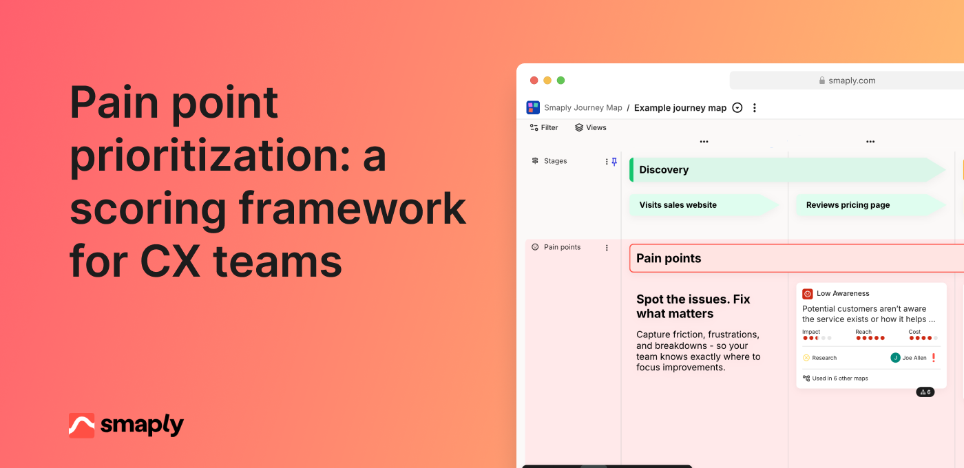
1. List your pain points. Extract them from your journey maps. Each pain point should be specific and observable, not a vague category. "Customers can't find the password reset option" is scorable. "Onboarding is confusing" is not. If your journey maps capture pain points as structured portfolio items, this step is straightforward. If they're sticky notes from a workshop, you'll need to refine them first.
2. Check your evidence. For each pain point, note what data you have for each dimension and what's an assumption. A pain point with strong frequency data but no severity evidence gets scored differently than one with rich qualitative support across all three dimensions. Flag the gaps so you know where confidence is low.
3. Score individually first. Each participant scores all three dimensions independently before any group discussion. This prevents anchoring bias, where the first person to speak sets the range for everyone else. Use a shared spreadsheet where scores are hidden until everyone has entered theirs.
4. Calculate the combined score. Sum the three dimensions. A pain point scoring 4 (severity) + 5 (frequency) + 3 (business impact) = 12. Simple addition works for most teams. Weighted scoring (giving business impact more weight, for example) is an option, but adds complexity without proportional benefit unless your team has a specific reason to weight one dimension over others.
5. Rank and review. Sort by combined score. The top items are your candidates for action. Review the ranking as a group to catch anything the math missed. A pain point that scores 10 might still outrank one that scores 11 if the evidence behind it is stronger.
Smaply keeps every pain point, its score, and the fix it drives in one shared place your team can act on.
Running a cross-functional scoring session
Scoring works best with diverse perspectives in the room. A CX lead sees the journey differently than a product manager, who sees it differently than a support operations lead. Those different viewpoints make the scores more accurate.
Who to include: CX or journey management lead, product manager, support or operations representative, and optionally someone from engineering or design who understands implementation effort. Keep the group to 4-6 people. Larger groups slow the process without improving quality.
Format: Present each pain point with its available evidence. Give participants 2-3 minutes to score individually, then reveal scores. Discuss any dimension where scores diverge by more than 2 points. The discussion isn't about reaching consensus. It's about calibrating: making sure everyone interprets the scale the same way and weighs the evidence similarly.
Time: Plan 60-90 minutes for 15-20 pain points. Front-load calibration by scoring the first 3-4 items slowly and discussing openly. The remaining items go faster once the group is aligned on how to apply the scale.
Common pitfall: The loudest voice dominates. Individual scoring before discussion is the single most effective countermeasure. When someone has already committed to a score, they're less likely to defer to the most senior person in the room.
From scores to decisions
A ranked list of pain points isn't a plan. The top-scored items still need to pass through a feasibility check before they become commitments.
Plot the top 10-15 pain points on an impact-versus-effort grid. Combined score goes on the vertical axis. Estimated effort to address the pain point goes on the horizontal axis. You don't need precise effort estimates at this stage. Rough t-shirt sizing (small, medium, large) from someone who understands the implementation work is enough.
High score, low effort: Fix immediately. These are genuine quick wins backed by evidence, not just easy things.
High score, high effort: Plan and resource. These belong on your CX roadmap with timelines and executive sponsorship.
Low score, low effort: Address if capacity allows. Don't let these crowd out the high-score items.
Low score, high effort: Skip. If someone argues for one of these, the framework makes the trade-off visible.
This is where pain point prioritization connects to your CX roadmap. The scored, ranked, feasibility-checked items become inputs to quarterly planning. Each priority needs an owner, a timeline, and a success metric. The customer journey KPI at the relevant touchpoint or stage should move when the fix is delivered. If it doesn't, either the solution missed the mark or the metric isn't capturing the change.
When you don't have enough data
Not every pain point comes with quantitative evidence attached. That's normal, especially for teams earlier in their journey management maturity or working from assumption-based journey maps that haven't been fully validated.
Options for evidence-light scoring:
Use frontline staff input. Support agents and onboarding specialists have strong intuitions about severity and frequency. Three conversations with frontline staff can provide directional scoring for pain points that lack formal data.
Use support ticket volume as a proxy. High ticket volume at a specific touchpoint is a strong frequency signal. Sentiment in those tickets gives you severity direction.
Score with what you have and flag assumptions. Mark confidence level alongside each score: high (data-backed), medium (partial evidence), or low (assumption). Re-score when better data arrives. This keeps the process moving without pretending assumptions are facts.
Do lightweight validation. Watch 10 session recordings for a specific pain point. Review 50 recent support tickets. Ask frontline staff. These activities take hours, not weeks, and can shift a score meaningfully.
An evidence-light score is better than no score. The framework's value isn't precision. It's making trade-offs explicit and creating a shared language for discussing where to invest.
Common scoring mistakes
Scoring on gut feel without evidence. The framework exists to move past opinions. If a score isn't connected to any evidence, even directional evidence from frontline staff, it's a guess dressed up as a number. Challenge unsupported scores in the session.
Treating all dimensions as equal when they shouldn't be. For some teams, business impact legitimately matters more than frequency. That's fine. But be explicit about it. If you're weighting dimensions, document the weights and the reasoning. Hidden weighting creates hidden disagreements.
Scoring once and never revisiting. Pain points change. New features reduce severity. Growth changes frequency. A competitor launches something that shifts customer expectations. Re-score quarterly, aligned with your journey map review cadence.
Conflating pain points with solutions. "We need a new onboarding flow" is a solution, not a pain point. "Customers can't find their first project within the first session" is a pain point. Score the problem, not the proposed fix. Solutions come after you've decided which problems are worth solving.
FAQs
What scoring criteria should CX teams use?
Severity (how bad), frequency (how common), and business impact (what it costs). Three dimensions are enough for most teams. Adding more creates scoring fatigue without meaningfully improving the quality of decisions. If you need to weight one dimension more heavily, keep the weighting simple and document it.
How do you handle disagreements in scoring?
Individual scoring before group discussion prevents anchoring bias. When scores diverge by more than 2 points on any dimension, discuss the evidence behind each score. The goal isn't consensus. It's calibration: making sure the group interprets the scale consistently and weighs available evidence similarly.
How often should you re-score pain points?
Quarterly, aligned with your journey map review cadence. Also re-score after major product launches, process changes, or new research that changes what you know about a pain point's severity or frequency. Priorities that never change are a sign the framework isn't being maintained.