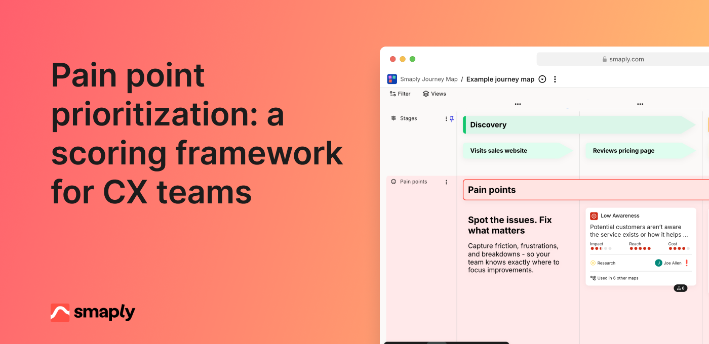
A CX team pins its onboarding journey map up for a quarterly review. Almost every step carries a number: a satisfaction score on the signup screen, another on the verification email, another on the welcome call. Someone asks why step three sits at 72 and step four at 81, and nobody in the room can answer, because nobody knows what the customer was thinking about when they typed the number. The map is fully instrumented and completely mute.
Putting NPS, CSAT and CES on a journey map is a design decision, not a coverage exercise. Each of the three asks about a different span of experience, so each one only reads honestly at one level of the map. Get the level right and a bad number tells you which part of the map to open. Get it wrong and you collect numbers that move for reasons nobody can trace back to anything you could change.
The three altitudes of a journey map: where NPS, CSAT and CES each read
A journey map holds three levels of granularity, and each of the three perception metrics reads cleanly at exactly one of them: NPS at the relationship, CSAT at the stage, CES at the step. That is the placement rule, and most of the trouble teams have with journey metrics traces back to breaking it.
Those levels are concrete parts of the artifact. The map covers one persona in one scenario, sitting inside a relationship that began before the first column and continues after the last. A stage groups several steps into a phase the customer lives through as one thing: getting set up, getting the problem fixed, renewing. A step is one interaction in one column, like the identity verification screen.
Each metric asks about a different span of that structure, so it can only be answered honestly at a matching span. Ask someone how likely they are to recommend you immediately after a password reset and you get a number about the whole relationship, collected at a moment with almost nothing to do with it. The response is real. It just is not about the thing you attached it to.
- Asks about the whole arc
- Belongs to the map, not a column
- Reads as a trend line above the map
- Asks about one phase
- Belongs to a stage boundary
- Reads against how the stage was chunked
- Asks about one interaction
- Belongs to a single column
- Reads against friction already on that step
The differences look small written down. In practice they decide whether a bad score sends someone to a specific screen or to another meeting.
NPS at the relationship altitude
NPS asks whether someone would recommend you, a judgment about everything they have experienced so far. On a map, that makes it a property of the journey or the persona rather than of any column. Its natural home is a line running above the map, showing how the relationship reading has moved over time, with the stage and step numbers underneath as the explanation.
Anchoring NPS to a step corrupts it in a specific way: the score picks up whatever just happened instead of the relationship, so the trend line tracks your survey timing rather than customer loyalty.
CSAT at the stage altitude
CSAT asks how satisfied someone was with something, and the smallest chunk of a journey a customer perceives as one thing is a stage. Getting set up is an experience they can rate. The fourth screen of getting set up usually is not.
Fire the survey once the customer has crossed the stage boundary, not partway through. If you cannot name the moment a stage ends, you cannot fire a CSAT for it. Treat that as a finding about the map, because unclear boundaries usually mean the staging was drawn around internal handoffs instead of around what the customer experiences.
CES at the step altitude
CES asks how much effort something took, and effort is the one perception metric that survives being asked about a single interaction. The customer has a direct, recent memory of how hard the thing was, and can answer without averaging across anything.
That does not mean every step gets one. The steps worth instrumenting are the ones the map already flags: a pain point, a visible drop, a workaround somebody documented during research. If the map shows no friction at a step and you put a CES on it anyway, you are spending a customer's patience to confirm something you already believe.
What a wrongly placed metric costs you
A metric at the wrong altitude still produces a number, still moves, and still gets reported. What it loses is traceability, so teams argue about which reading is correct instead of opening the map and fixing the thing. Run one test before committing any placement: if this number went bad next month, would we know which part of the map to open? A placement that fails it costs you response capacity you need elsewhere.
What you attach the number to, and how it gets there
Knowing that NPS is relational does not tell you what fires the survey, how long after the interaction, where the answer ends up, or who looks at it. That gap is where most measurement layers fall apart, usually about six weeks after the workshop that designed them. A metric on a journey map is four decisions: what is measured, what fires the collection, where the result is read, and who reads it. Skip any one and the placement degrades into a survey nobody sees the output of.
Attach the metric to the map element, not to a slide
A number that lives on the journey map next to the step it describes behaves differently from the same number in a survey tool's dashboard. On the map it is read alongside the pain point, the customer quote, and the name of the person who owns that stage. In the dashboard it is read alongside nineteen unrelated scores, by someone whose job is reporting rather than fixing.
Four things should travel with a metric attached to a map element: the definition, the current value, the trend, and a route back to the raw responses. The score tells you the temperature and the verbatims tell you what happened, and a team that has to file a request to read them will stop asking.
Trigger and delay
Three trigger types cover almost everything, and the altitude decides which one you want. Getting that pairing wrong is the most common reason a score drifts away from the thing it is attached to:
- Event-based, for step-level CESFires when a specific interaction completes, within minutes of it ending.
- Stage-completion-based, for stage-level CSATFires when the customer crosses a stage boundary, with a delay of a day or two so they are rating the outcome rather than the last screen.
- Cadence-based, for relational NPSFires on a schedule regardless of activity, and the decoupling from events is the point.
Delay is where step-level measurement most often goes wrong. Too fast and you measure the interface: the customer answers about the button they just clicked. Too slow and they are answering about something else, because by then the support call has merged with the billing question into one impression.
Sample floor: when a number is worth reading
The further down the map you place a metric, the fewer responses each placement collects. A step with eleven responses a month will swing ten points in either direction for no reason at all, and someone will build a theory about it.
Set a floor per placement before you turn it on, and decide in advance what happens when a step cannot clear it. Widen the collection window and report quarterly instead of monthly. Roll the step up and measure at its stage. Or accept the placement as a qualitative signal, where you read the comments and ignore the score.
Some steps simply do not carry enough traffic to support a metric, and instrumenting them anyway produces noise that discredits the rest of the measurement layer. A system that has been publicly wrong three times is harder to fund than one that covers less ground.
A worked example: instrumenting one onboarding journey
Take a B2B software onboarding journey with eight steps across three stages: account setup, first configuration, first real use. Roughly 300 new accounts a month enter it.
| Where | Metric | Trigger | Responses / month | Paired behavioral number |
|---|---|---|---|---|
| Whole journey | NPS | Cadence, day 45 | ~90 | 90-day retention |
| First configuration stage | CSAT | 24h after stage completion | ~60 | Stage completion rate (78%) |
| Data import step | CES | On completion | ~55 | Import success rate |
| SSO setup step | CES | On completion | ~40 | Time on task |
| Billing details step | None | Below the 30-response floor | ~12 | Completion rate only |
Four placements across eight steps, and the shape of the decision matters more than the specific numbers. The relational anchor sits above the whole journey on a fixed cadence. One stage carries a CSAT, chosen because the map already showed the largest drop there. Two steps carry a CES, both flagged in research as places customers got stuck. Every perception placement sits next to a behavioral number from product data, so a score always has something to be checked against.
The billing-details step is the interesting one. It looked important, several churn interviews pointed at it, and it could not clear a 30-response floor because most accounts pass through it in under a minute without incident. Rather than instrument it and pretend, the team left it with a completion rate and a note to revisit if volume grew.
Pair every score with a behavior and a verbatim
Three readings per placement give you a complete picture: the behavioral number says whether people got through, the score says how it felt, and the open text says why. Any one alone will mislead you eventually, and the combinations are what make a bad month diagnosable. One open question per placement is enough, phrased to ask for the reason behind that specific score, because general invitations to share feedback produce text nobody can sort.
Smaply connects live metrics to the exact step, stage, or journey they describe, next to the evidence.
How many placements one journey can carry
Treat measurement as a budget rather than a coverage target. Every placement spends a portion of a customer's willingness to answer, and that willingness is finite across the whole relationship, not per survey and not per team.
A workable starting shape for one journey is a single relational anchor, one or two stage-level placements, and two or three step-level placements. Go above that while a journey is under active redesign and you need the resolution, then come back down. The test for any extra placement is whether a bad number there would change a decision someone has the authority to make this quarter.
Fatigue does more than reduce your response count. Response rates fall as ask frequency rises, and the customers who stop answering first are the least engaged ones, so an over-instrumented journey drifts optimistic exactly when it should be warning you. Across a portfolio, the journeys currently being worked on carry full instrumentation and the rest carry the relational anchor alone until they come up for attention.
Reading the three altitudes against each other
One reading is a number. Three readings at different spans is a diagnosis, and the diagnostic value comes from the places where they disagree. A journey where all three altitudes agree tells you very little beyond whether things are broadly fine.
Four disagreements come up often enough to be worth naming:
- Step CES bad, stage CSAT fine. A localized friction the customer absorbed. The fix is contained to one step and rarely urgent.
- Stage CSAT bad, every step CES fine. No single interaction is hard, but the phase fails as a whole. Look at sequencing, waiting time and expectations in the gaps between steps.
- Relational NPS falling, stage and step numbers healthy. You are measuring a journey that is not driving the relationship. Either an unmapped journey is doing the damage, or the cause sits outside the journeys entirely.
- Everything bad at once. Not a measurement finding. Go back to the qualitative evidence before touching the map.
The second pattern is the one a journey map is uniquely good at catching. Step-level metrics only ever measure the columns, and a stage can fail entirely in the space between columns: the four-day wait with no status update, the handoff where the customer re-explains what they need, the point where what they were told in step two contradicts what they are asked for in step five. None of the individual steps score badly. The stage does.
That is roughly what the onboarding example turned up. Both instrumented steps came back with acceptable effort scores, and the configuration stage CSAT was the worst number on the map. The gap was a two-day wait for a provisioning approval that appeared on nobody's step because nobody's team performed it.
Reading the altitudes together turns a measurement layer into decision support rather than reporting. A disagreement between two altitudes points at a specific stage of a specific map, which is something an owner can be assigned to, and that traceability from number to map element to owner is the part of customer journey management that measurement exists to serve.
Keeping the placements honest over time
Three things keep instrumentation from decaying: a named owner for each placement, a review cadence tied to the map's own review cycle, and a retirement rule for any placement nobody has read in two cycles. The failure they prevent is accumulation, because placements added for a project that finished three years ago keep firing surveys and producing numbers nobody opens.
Open your survey tool and list every trigger currently firing at customers. Any placement you cannot match to a step or a stage on a current map is either measuring the wrong thing or pointing at a map you stopped maintaining. In most organizations more of those triggers get switched off than kept, and the ones that survive are the placements somebody can name a reader for.
Bring Google Analytics, Power BI, and Excel data onto the journey, alongside the quotes and pain points.
Frequently asked questions
Can I put a CSAT score on every step of my journey map?
You can, but the scores will not mean much. CSAT asks about something the customer perceived as a single experience, and most individual steps are too small for that. Step-level questions are better served by CES. A survey on every step also burns response capacity you will want for the stages that matter.
What do I attach the metric to: the stage, the step, the touchpoint, or the map itself?
Match the metric to the altitude it reads at. CES attaches to a step, CSAT to a stage, and NPS to the map or the persona rather than any column. Touchpoints usually sit inside a step, so a touchpoint-level metric is a step metric with a channel filter on it. Attach it to the map element rather than a separate dashboard, so it is read next to the pain point it explains.
How many responses do I need before a step-level score is worth acting on?
Set a floor per placement and hold to it. Thirty responses in the reporting period is a reasonable working minimum for spotting a real shift rather than noise. Below that, widen the window, roll the measurement up to the stage, or treat the placement as a source of comments rather than a tracked number.
Do I need all three metrics on every journey?
No. A journey under active work benefits from all three altitudes, because the disagreements between them locate the problem. A journey in maintenance can run on the relational anchor plus whatever behavioral data you already collect, and you add the other placements when it comes up for attention.
How do I read a bad CES on one step against a flat NPS?
That combination usually means a localized friction the customer absorbed without it changing how they feel about you. Worth fixing, and cheap to fix, but it should not jump the queue ahead of a stage-level problem. Watch it over two or three cycles. If effort keeps climbing on that step and the surrounding stage CSAT starts to slip, the friction has stopped being absorbed.
Should operational metrics like completion rate sit on the map too?
Yes, next to the perception metric rather than instead of it. Completion rate, drop-off, and time on task tell you whether people got through, and the score tells you how it felt. When the two disagree, that is usually the most informative thing on the map: a step with a 95 percent completion rate and a terrible effort score is a step people push through because they have no alternative.